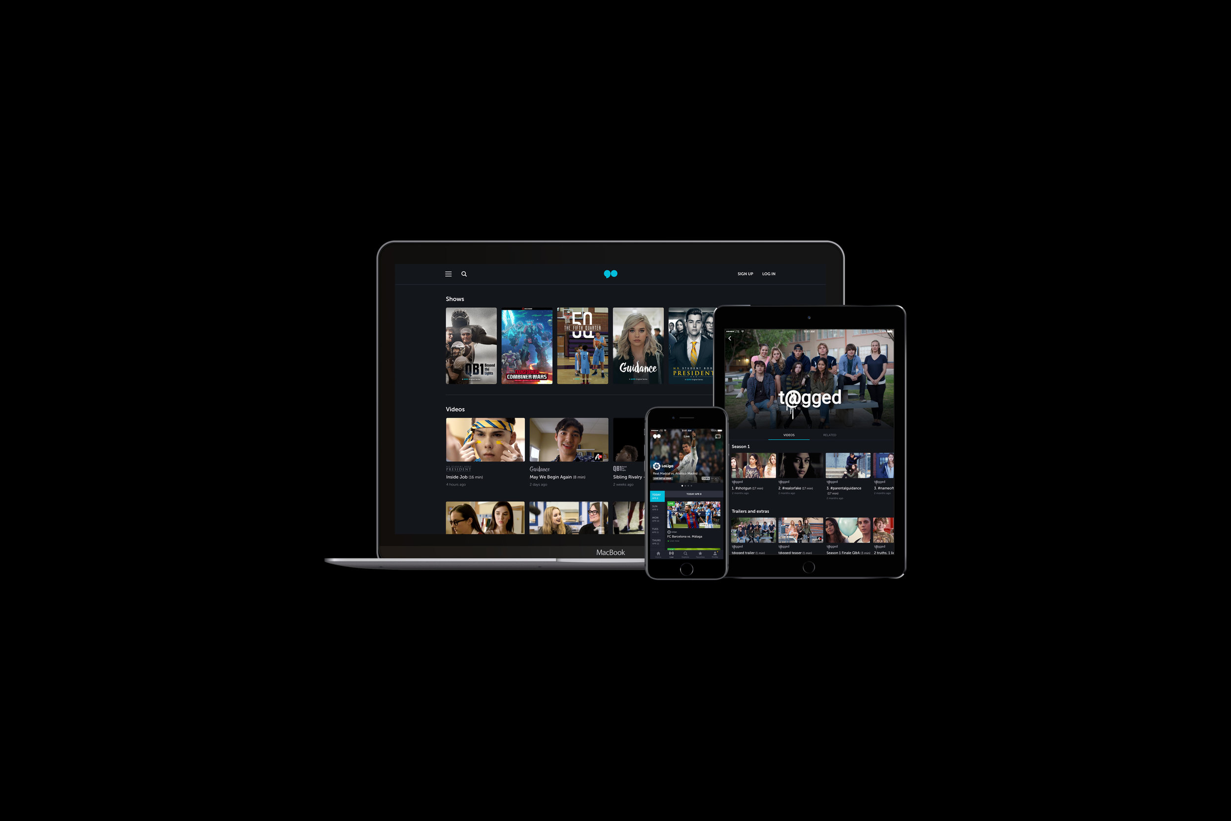
go90 Redesign
go90 is Verizon's cross-platform video streaming service for original shows, tv series, popular web series and live events. After Vessel was acquired, the team worked on a brand new version of the service. We spent 4.5 months re-writing the code base and redesigning the product from the ground up. Check out the experience on web or download the apps on App Store or Play Store!
Role: Lead all of design, worked with PMs and engineers
Timeline: 4.5 months
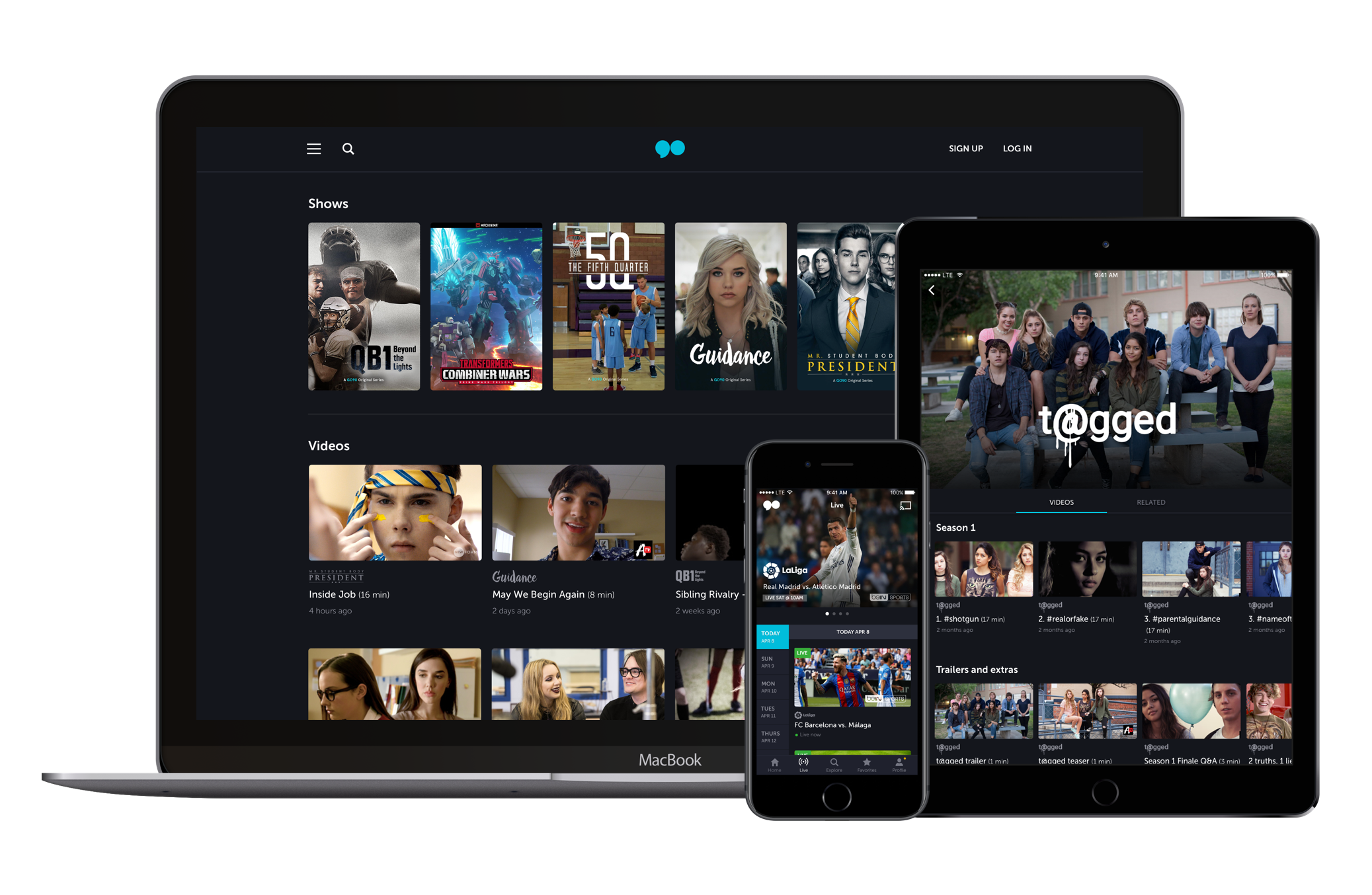
Creating a discovery-first experience
Our challenge was to combine features from Vessel and go90 and create a new experience that will improve the product’s discoverability, usability and visual design.
go90 has an extensive content offering, but it was not the easiest to discover and browse.
Before the redesign, content density was high but legibility was low.
Meta data overlaid small thumbnails, making it difficult to read. The different sections of the app are hidden in a hamburger menu, so navigation is cumbersome.
Shows and videos had the same template which made it difficult to distinguish between the two.
Typography and spacing felt crammed and was problematic for the Share and Comments tap-targets.
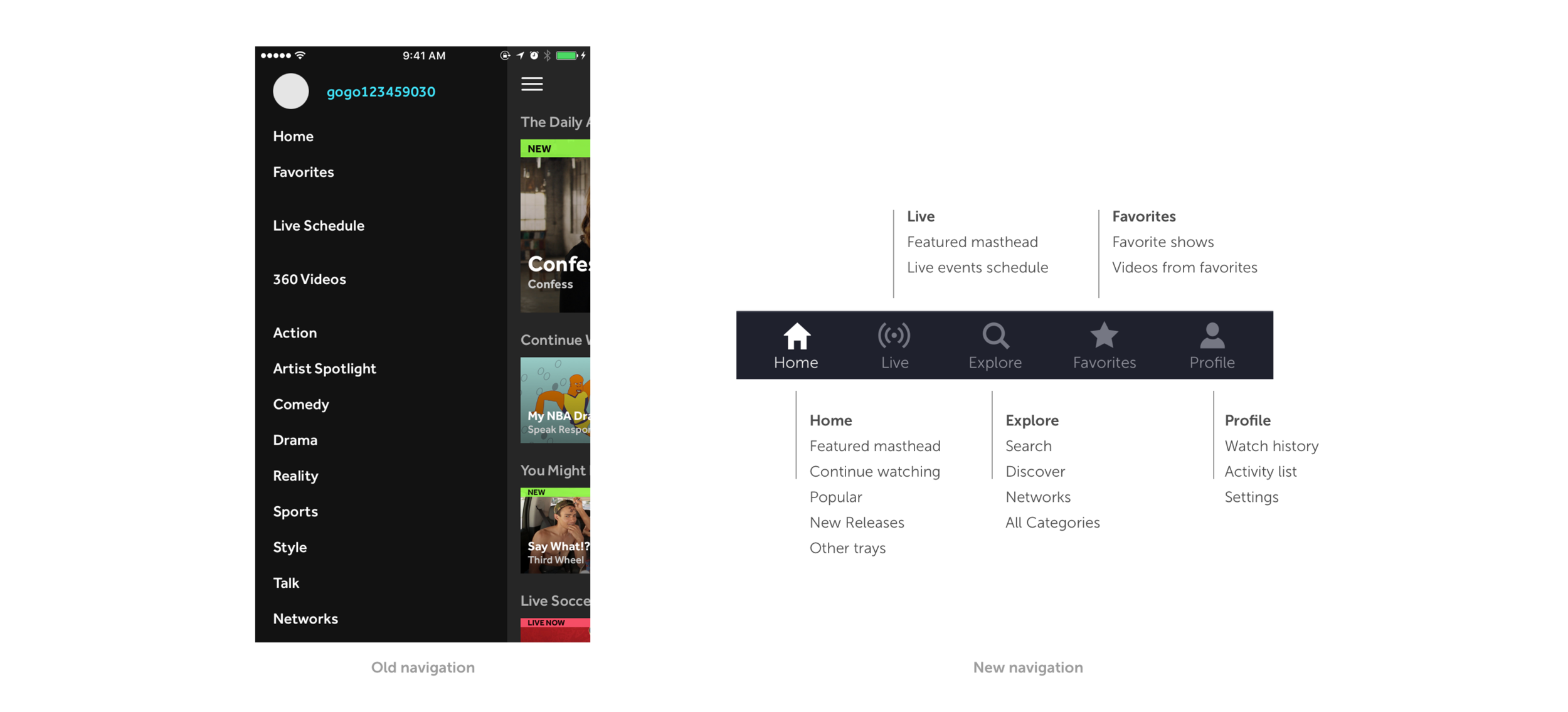
The hamburger menu prevented easy discoverability and navigation between sections of the app.
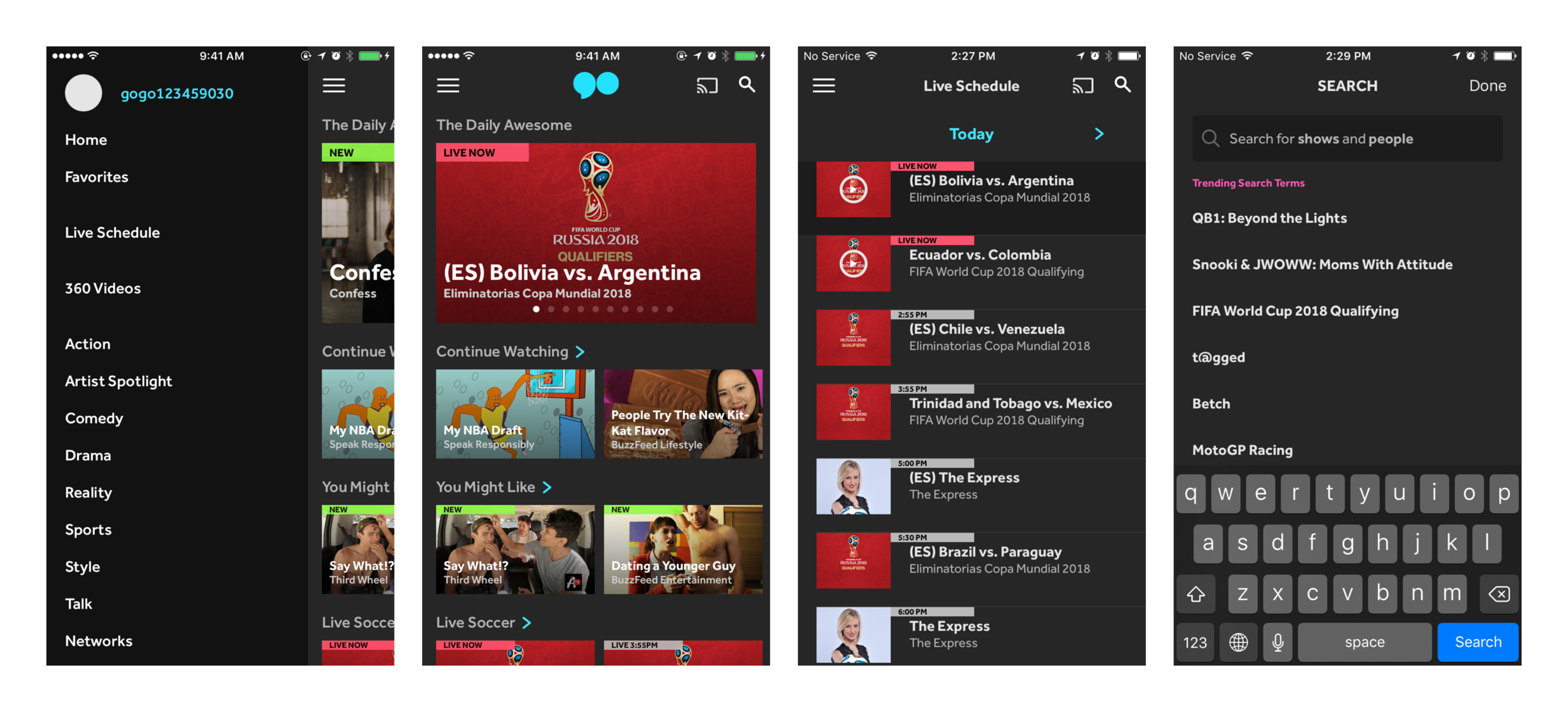
A bottom navigation was added to decrease the number of interactions to navigate through the app and to expose the main navigation areas.
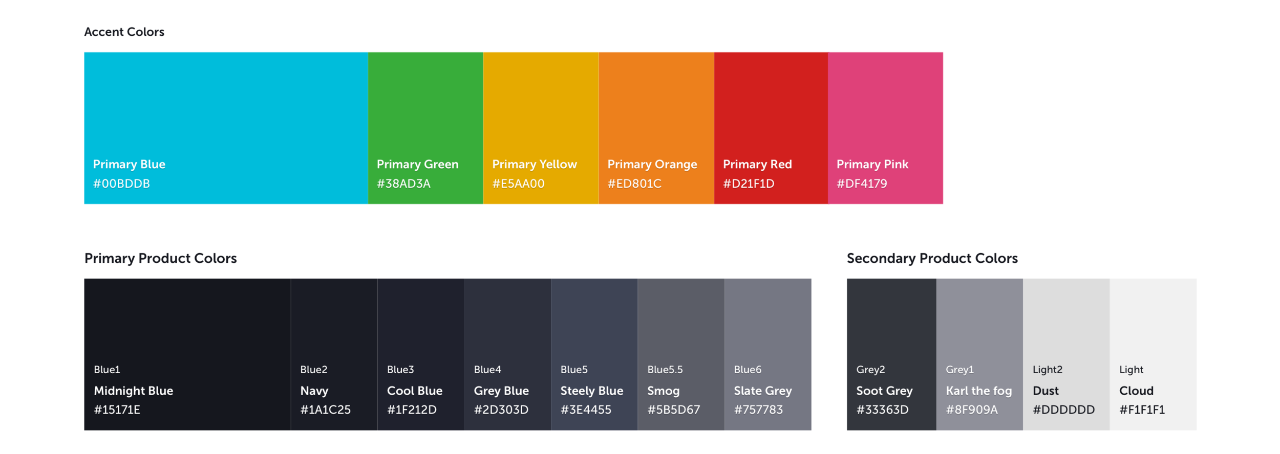
The new color palette stays true to go90's original branding and increases legibility.
The accent colors were adjusted so they are legible when used with white text and still feel fun like the original go90 brand. The primary UI colors increase the contrast of the content from the UI and to put more focus on the content.
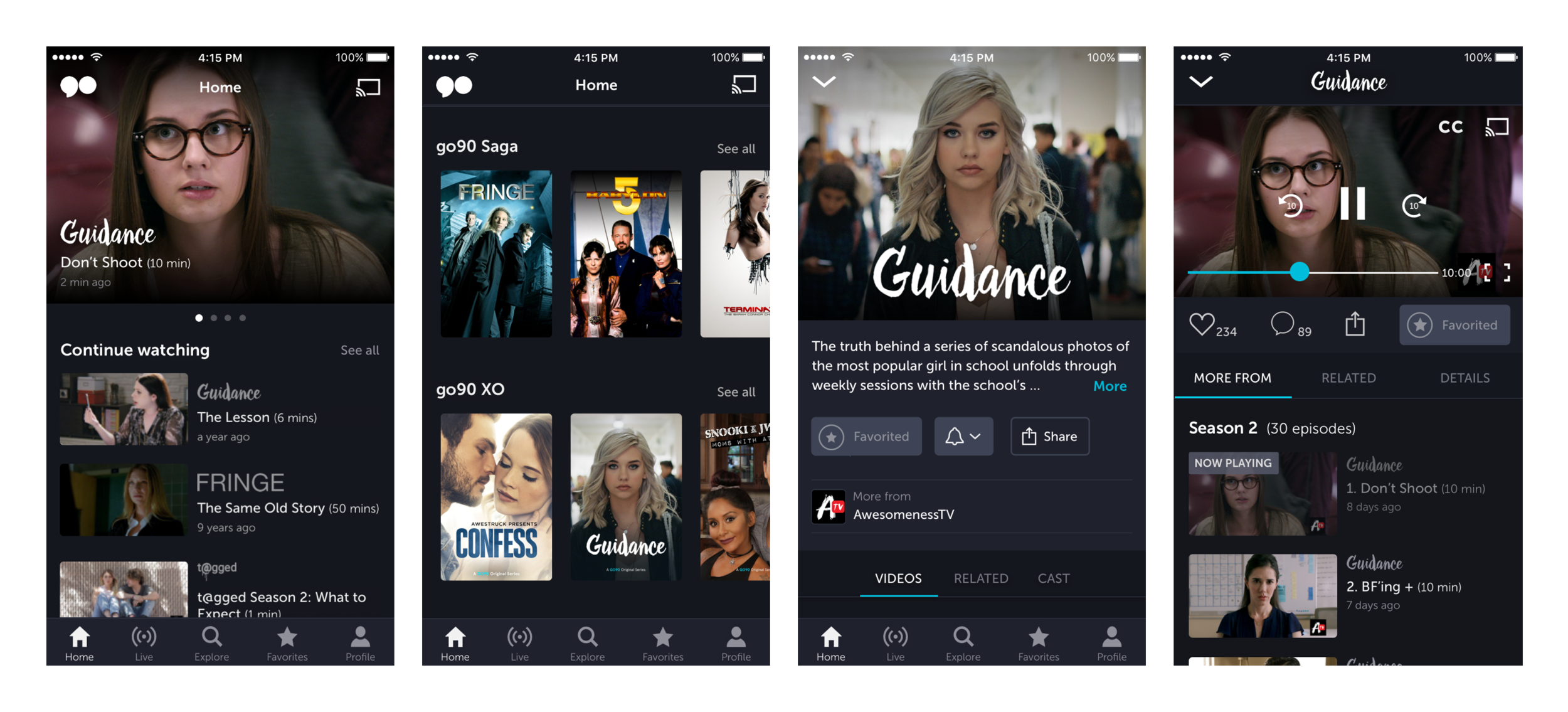
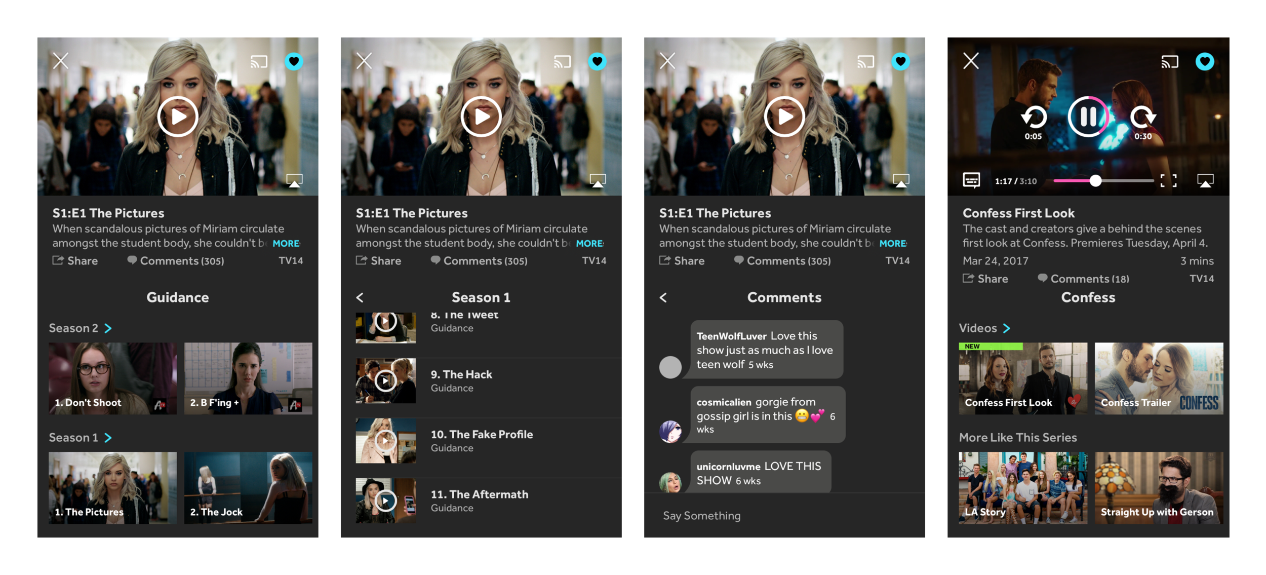
The new design has a different visual style for shows and videos.
Meta data is moved off of the thumbnails to maximize legibility and showcase content imagery. Large imagery and descriptions on show pages create a premium landing experience for each show. Whereas videos are primarily focused on the watch experience.
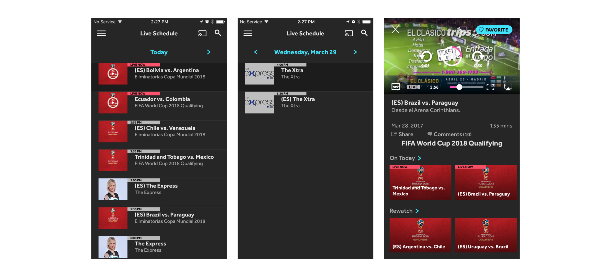
Browsing live events in the old schedule was inefficient.
You could only see one day at a time, so you needed multiple interactions if you want to see what's live in the future. Tags were small, so it wasn't easy to see what was currently live.
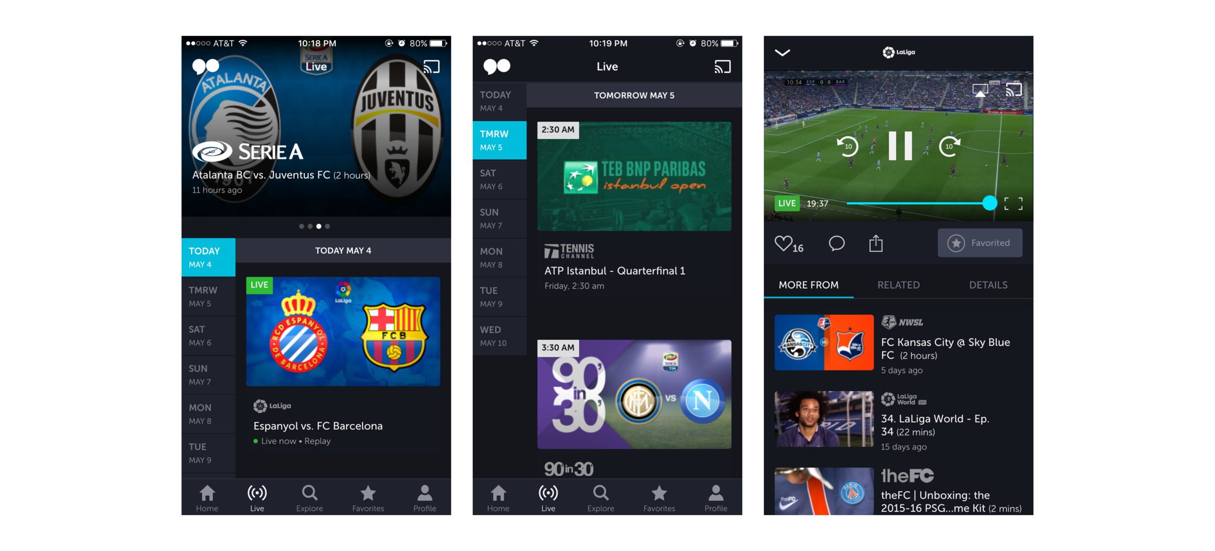
The new live schedule provides an overview of the week. It requires only one interaction to jump to a future date.
Larger video thumbnails showcase the event imagery and feature larger meta data for easier legibility.
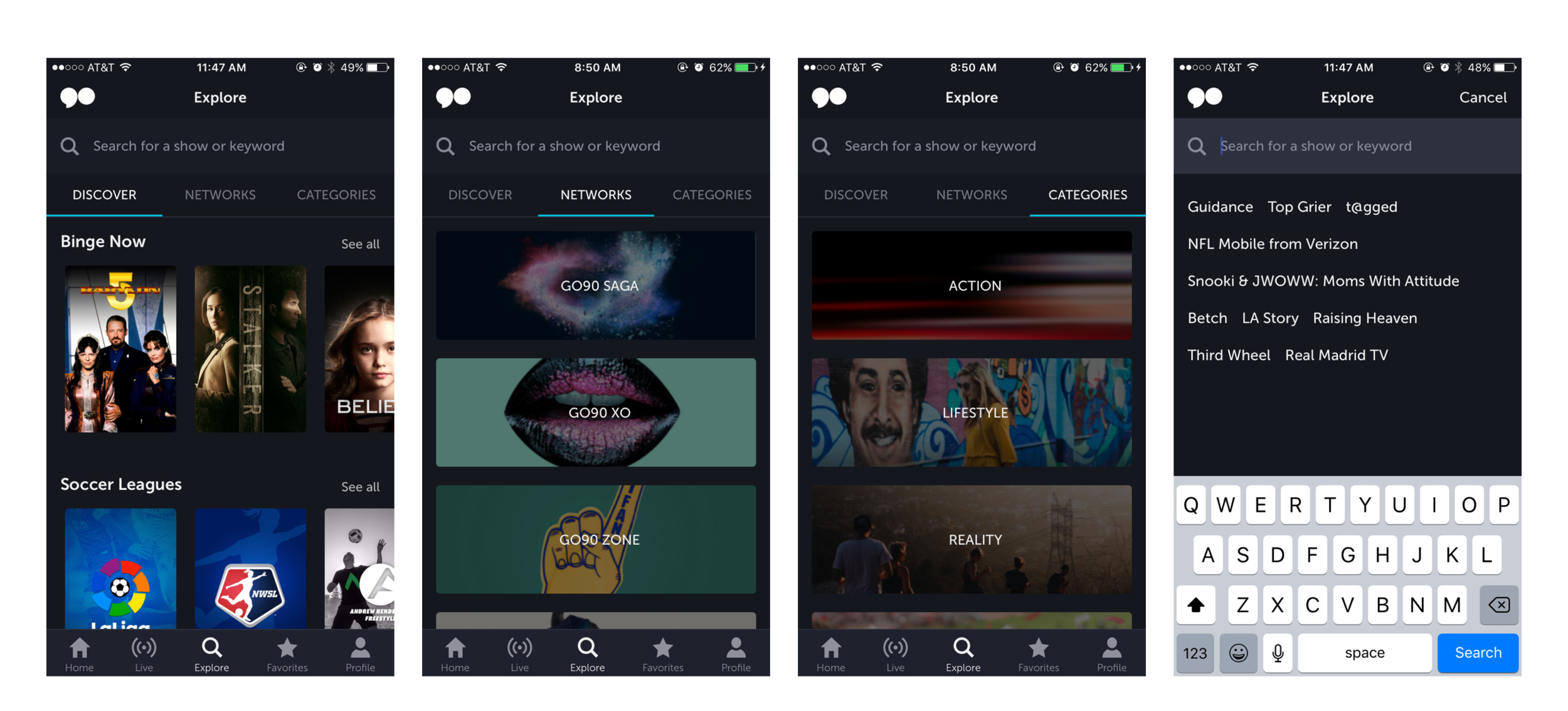
We created a way to explore new content while you're in the mindset of searching.
go90 has so much content, but the old design just had a direct search, so most of it went undiscovered. We surfaced shows and videos, go90 branded networks as well as the categories in in conjunction to a direct text search.
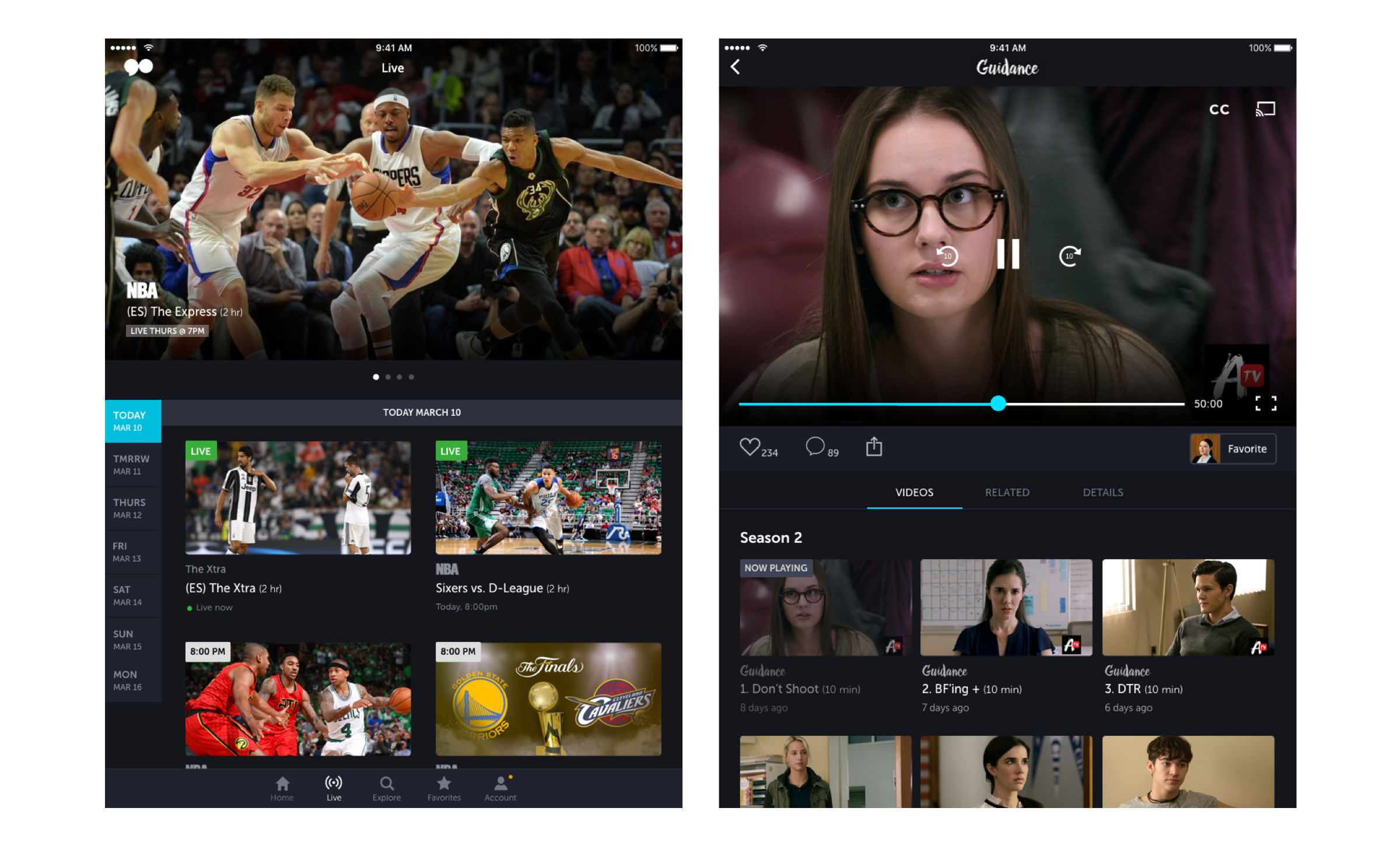
A look at go90 on tablet
The mobile designs were adapted to tablet by utilizing the horizontal real estate.
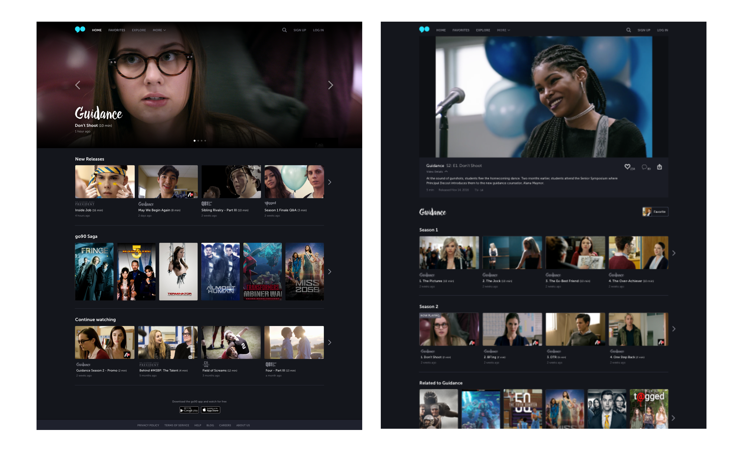
go90 on desktop web
We adapted the design from the apps to the browser and made sure the web conventions were followed without altering too much of the design system.
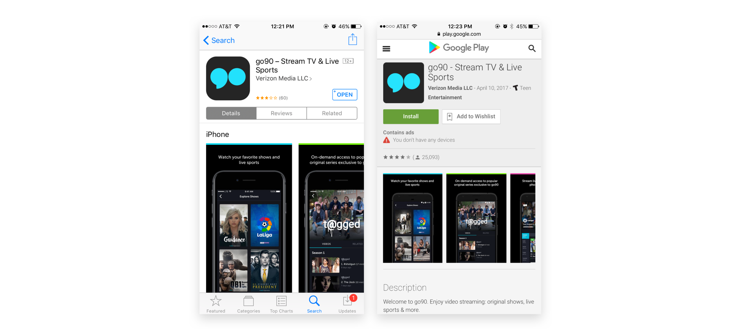
We launched go90 3.0 at the end of March 2017!
Check out the apps on iOS and Android or head over to the website.
Thanks for reading! 🎉